|
Introduction |
How can the distribution of patient casemix be visualised?
–
DRG based data evaluation can show many details.
But sometimes it is difficult to obtain an overview.
Besides the big number of DRGs,
a further complication is the very unequal distribution
of patient frequencies across DRGs:
some few DRGs are very highly frequented;
many DRGs show small numbers. |
|
Data |
20'436 case records of eight Swiss children\'s hospitals
or departments
from the year 2005 classified by APDRGs were available
for the example evaluation.
These cases occupied 445 DRGs.
The range of frequencies spanned from 1 to 1272 cases. |
1
http:// www.r-project.org.
Dalgaard [R, 2002].
|
Methods |
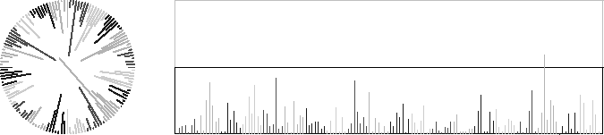
Instead of using a conventional bar chart,
a bar chart with a circular base line is drawn.
The labels of DRGs and MDCs are arranged around the circle
in a hierachical way. –
The figure was constructed using the
open-source statistical programming language R.1 |
|
Results |
Visualisation resulted in a compact
and nice diagram.
Only a third of the space of a conventional bar chart is occupied.
The «comprehensibility» of the figure seems to be better
because the eyes are catching the bundling of bars more easily. |
|
Discussion |
The longest spokes are crossing each other
in the middle of the plot.
The plot had to be arranged in a way that only a restricted
number of bars are longer than the radius of the circle.
Spoke plots are very well adapted to data showing
many lower-to-medium frequencies
and only some isolated higher frequencies.
It seems that the circular arrangement of bars
is easy to catch visually
because
we are strongly accustomed to
clocks and watches in everday life.
The multitude of DRGs caused the labels to be very tiny.
Nevertheless the labels can yield useful information
within the eye span.
(If necessary, they can be enlarged by using a magnifying glass
or the zoom function of the electronic document reader software.) |
|
Conclusions |
Spoke plots are able to visualise the number of patients
assigned to about a half thousend DRGs
in a very comprehensive and concise manner
on less than a single page. |
Table 1:
Space used by a spokeplot as compared to the space used by a barchart
|
|
Table 2:
Number of cases in 445 APDRGs of 8 children hospitals or departements
|
|
|
|
Source: Fischer [Grafiken zur PCS-Beurteilung, 2008]: 61. |
|
|
|
|
References |
|
- Dalgaard
- R
2002
| Dalgaard P. Introductory Statistics with R. New York (Springer) 2002: 267 pp. |
|
- Fischer
- Grafiken zur PCS-Beurteilung
2008
| Fischer W. Statistische Grafiken zur Beurteilung von Patientenklassifikationssystemen. dargestellt am Beispiel der pädiatrischen Sicht auf das APDRG-System. Wolfertswil (ZIM) 2008: 169 pp. Internet:
http:// www.fischer-zim.ch / studien / Grafiken-PCS-Beurteilung-0804-Info.htm. |
![[print]](../PIC/e-div/print.gif)
![[pdf icon]](../PIC/e-div/pdf.gif) pdf file
(48 KB)
pdf file
(48 KB) Grafiken zur PCS-Beurteilung